


With the proliferation of smartphones and mobile devices, the internet landscape has dramatically shifted. More than ever, consumers are using their mobile devices to browse, shop, and interact with brands. According to eMarketer, in 2021, mobile eCommerce sales accounted for nearly 73% of total eCommerce sales. With this trend set to continue, it is essential for businesses to leverage a mobile-first strategy to stay competitive.
What is Mobile-First Design?
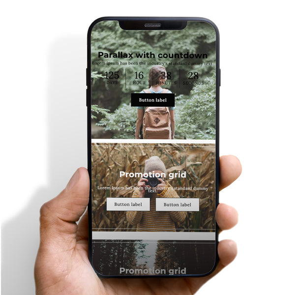
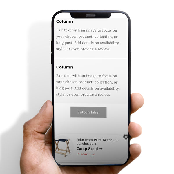
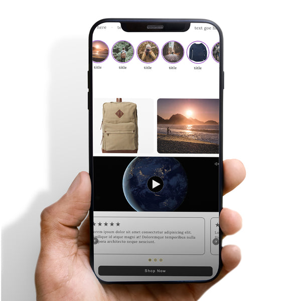
Mobile-first design is a web development approach that prioritizes the mobile user experience before scaling up to larger screens such as tablets and desktops. In other words, designers create a website for mobile first, and then adapt it for bigger screens. This approach is a reaction to the growing popularity of mobile browsing and shopping and the need for businesses to meet their customers wherever they are.

Why Mobile-First for eCommerce?
1. Changing User Behaviour
Mobile devices are increasingly becoming the go-to tool for online shopping. Mobile shopping offers convenience, flexibility, and a more personal touch compared to traditional desktop shopping. Mobile-first design accommodates this changing user behavior by providing a seamless user experience tailored to smaller screens.
2. Improved User Experience
Mobile-first design ensures that your eCommerce store provides the best possible experience for mobile users. It prioritizes speed, ease of navigation, and concise content – key factors in the success of any online store. Optimizing your website's design for mobile users can lead to higher engagement, reduced bounce rates, and increased conversions.

3. Better Search Engine Rankings
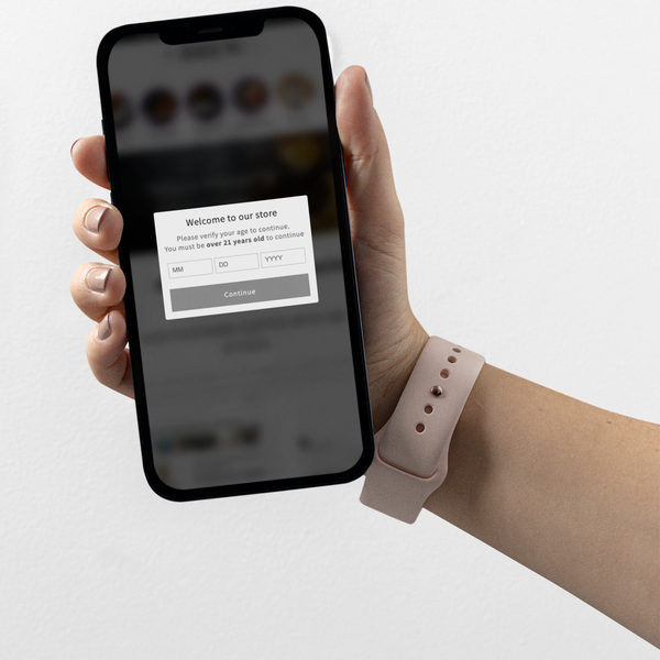
In 2018, Google switched to mobile-first indexing, meaning the search engine predominantly uses the mobile version of the content for indexing and ranking. If your eCommerce site is not mobile-friendly, it could hurt your search engine rankings, resulting in decreased visibility and lower traffic. On the other hand, a well-optimized, mobile-first site can boost your SEO and help you rank higher in search results.
Implementing a Mobile-First Strategy for your eCommerce Store
1. Responsive Web Design
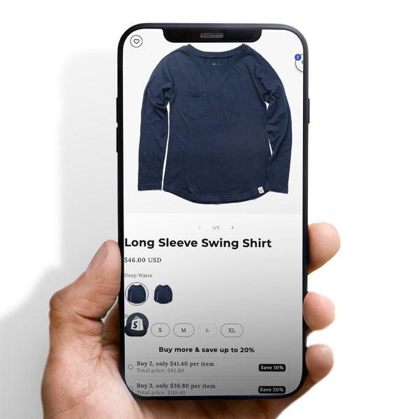
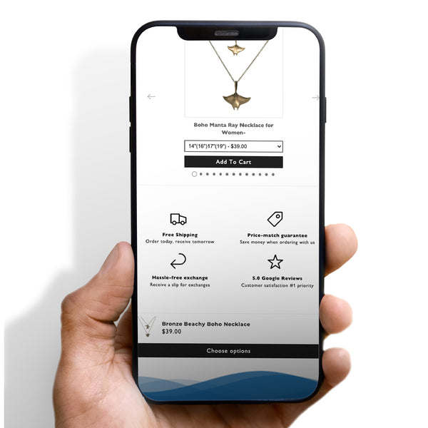
Start by employing a responsive web design, which adjusts to the screen size of the device a visitor is using. Ensure that your site's layout, images, and functionalities work seamlessly across all screen sizes.
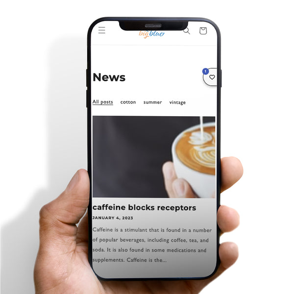
2. Simplify Navigation
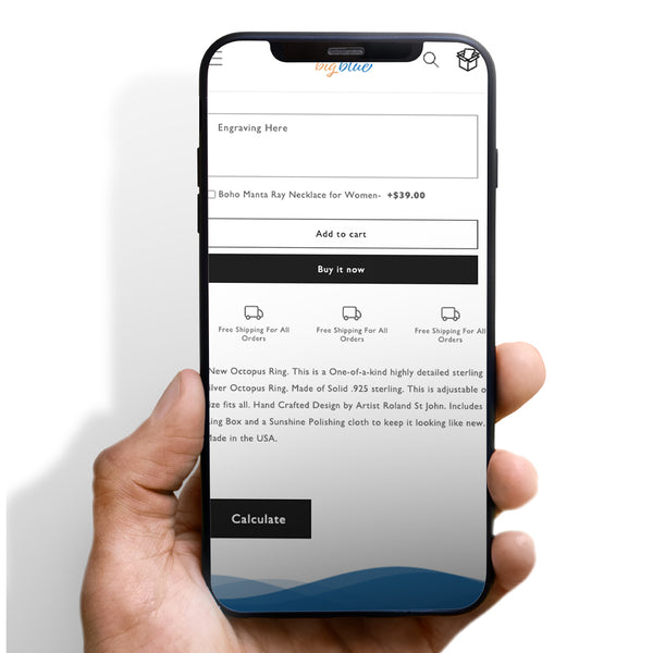
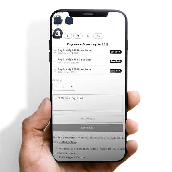
Mobile screens offer limited space, so it's crucial to prioritize functionality over aesthetics. Simplify your site's navigation by reducing the number of options in the menu, utilizing drop-down menus, and ensuring clickable elements are large enough for a fingertip.

3. Prioritize Page Load Speed
Mobile users often have shorter attention spans, making page load speed crucial. Optimize your images, minify code, and leverage browser caching to improve your site’s loading time.

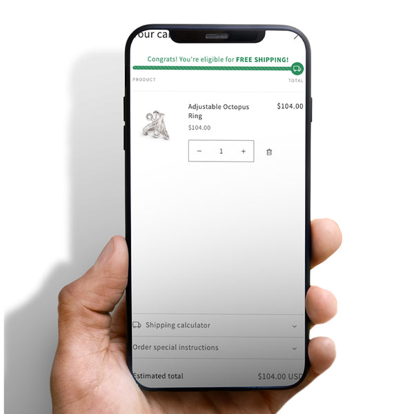
4. Streamline Checkout Process
A complicated checkout process can lead to cart abandonment. Streamline the process by reducing the number of steps, offering guest checkout options, and integrating popular mobile payment solutions like Apple Pay or Google Pay.


 5/5 from 144 reviews