Before making any changes to your checkout page, make sure you know exactly what needs to be changed. There is a risk that going at something blindly might backfire. Use Google Analytics, heatmaps, and A/B testing to identify spots of friction and drop-off, and then make appropriate modifications to increase conversion rates.
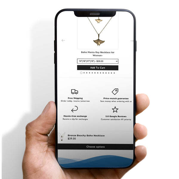
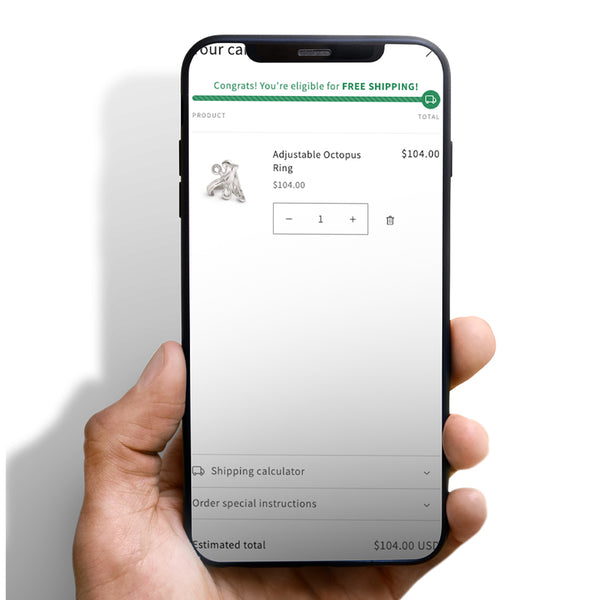
1. Offer Free Shipping
It's one of the most common faults I find in dropshipping shops, and it's one of the most common conversion killers...
In 2022, customers will begin to expect free delivery. About 65 percent of cart abandonment is due to high shipping costs, so it's preferable to be honest about them or, if feasible, eliminate them altogether. I can promise you that this will instantly enhance your conversions.
2. Skip the mandatory registration
Guest checkout is becoming more popular among customers, who anticipate having it available when they reach the payment page. Be sure to eliminate the registration barrier in order to maximize conversions by offering the opportunity to log in through social networks and Gmail, or by requesting registration on the thank you page.
3. Offer multiple payment options
For the sake of avoiding confusion later in the purchase process, payment alternatives should be shown as early as the product page. The more payment options your consumers have, the more likely it is that they will finish their transaction.
4. Help buyers feel more secure
Customers are more likely to complete their transactions if they are less concerned about the potential dangers of internet buying. With the help of security seals and payment logos, you may do so. You can also provide a money-back guarantee or free refund option.
5. Add the “Save the cart” option
Increasing the likelihood that a customer will return to finish their purchase is as simple as giving them the option to store their cart contents or certain products for later.







 5/5 from 144 reviews


