Millions of people rely on their smartphones every day. Web-enabled gadgets like smartphones and tablets have become vital communication tools throughout the world. However, most firms observe lower phone conversion rates than PCs. Please read the following post to learn how to solve the aforesaid scenario and increase mobile conversions.
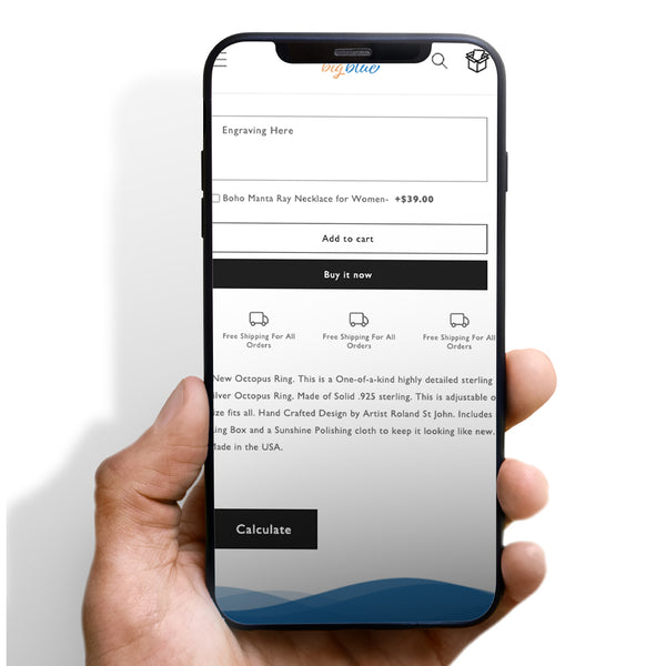
1. Button Placement
You must always place the purchase button in the most visible location. This will lower bounce rates and enhance conversion rates. To attract more clients, create a gorgeous, conspicuous buy button with a clear call to action.
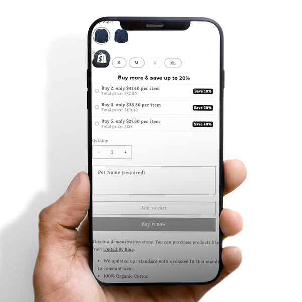
2. Cut unnecessary form fields
Because mobile displays are often small, extensive forms with extraneous components may make your site seem unprofessional. This will undoubtedly dissatisfy your consumers.
Keep your mobile UI basic. But you must ensure they are informative. So clients are more readily enticed, purchases are speedier, and conversion rates are greater.
3. User-friendly design
Notably, your website must be user-friendly. Your website's content and titles must be correctly separated and suitable with mobile devices. Content must also be consistent and distinct. This will help companies provide a fantastic shopping experience to consumers.
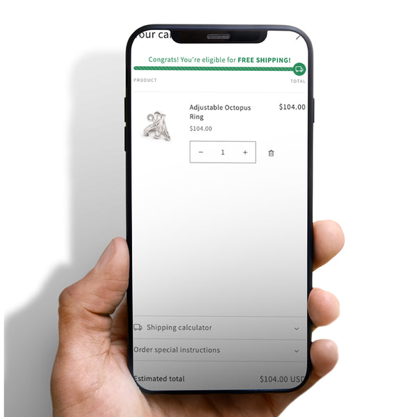
4. Improve the checkout flow
"One-click purchase" is a term that we've all heard at some point or another. Shows buyers' desire for speed and ease in purchasing. Make sure the checkout procedure is optimized if you want the transaction to go smoothly.
By reducing the amount of time spent at the checkout, consumers will be more likely to make further purchases.
5. Follow up
Users on mobile devices may not be able to make a purchase or start an order right away when they visit your site. Using SMS and alerts, for example, may help you re-engage people who have already left your site. There are several ways to do this, including a simple notification that the shopping basket is full. Customers are more likely to return to your shop if you use this method.







 5/5 from 144 reviews


