One of the most important factors in a successful eCommerce store is accessibility. For customers, that means making it easy for them to find what they're looking for and navigate through the site without confusion. As online shopping becomes more and more commonplace, it's vital that online stores make their sites as easy to navigate as possible.
One of the most common problems in online stores these days is the overuse of zooming features. Many stores use these features of the website to help customers get a better look at the products they're interested in, but it can be a confusing experience for potential customers if the site isn't set up properly. To help your store stay user-friendly and avoid excessive zooming, there are a few steps you can take.
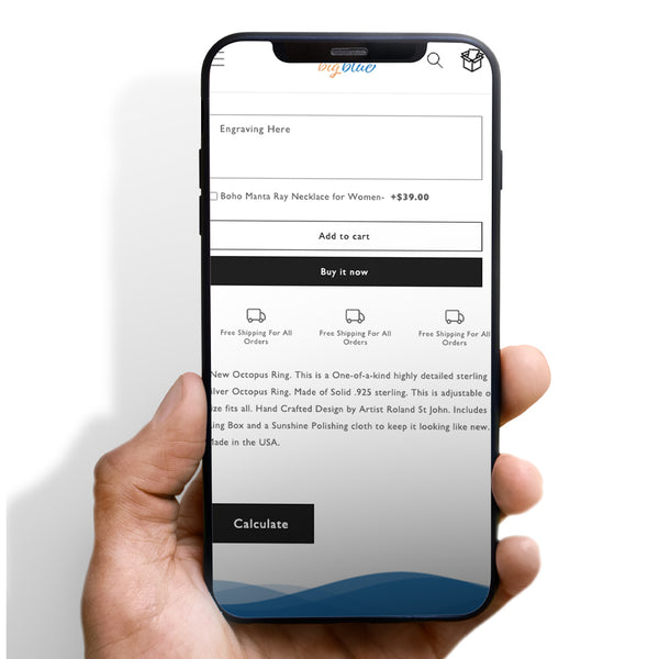
First, you can disable your zoom feature completely for product description pages so that customers can't zoom in on certain parts of the page to get a better look. This will help to eliminate confusion and make it easier for your customers to find the information that they need without having to zoom in on different parts of the page.
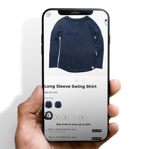
Secondly, you can add a description to each product so that customers can read more about it before they decide whether or not to buy it. This will give your products more visibility and help you generate more sales.
Finally, you should try to minimize the number of images you use on your site. The more images you have on your pages, the more difficult it will be for customers to find the information they need.








 5/5 from 144 reviews


